I was planning last year that I will have to start looking for ways to avoid Google as much as possible or at least minimize my dependence on Google services. It's most likely the latter.
On September 18, 2023§
I finally switched to a new email provider called Mailbox. I have little information about the company but it seems it's well known from various tech people I met.
First impressions§
When I went to their website, it looks so clean and green like the "green energy" message they have on their landing page.

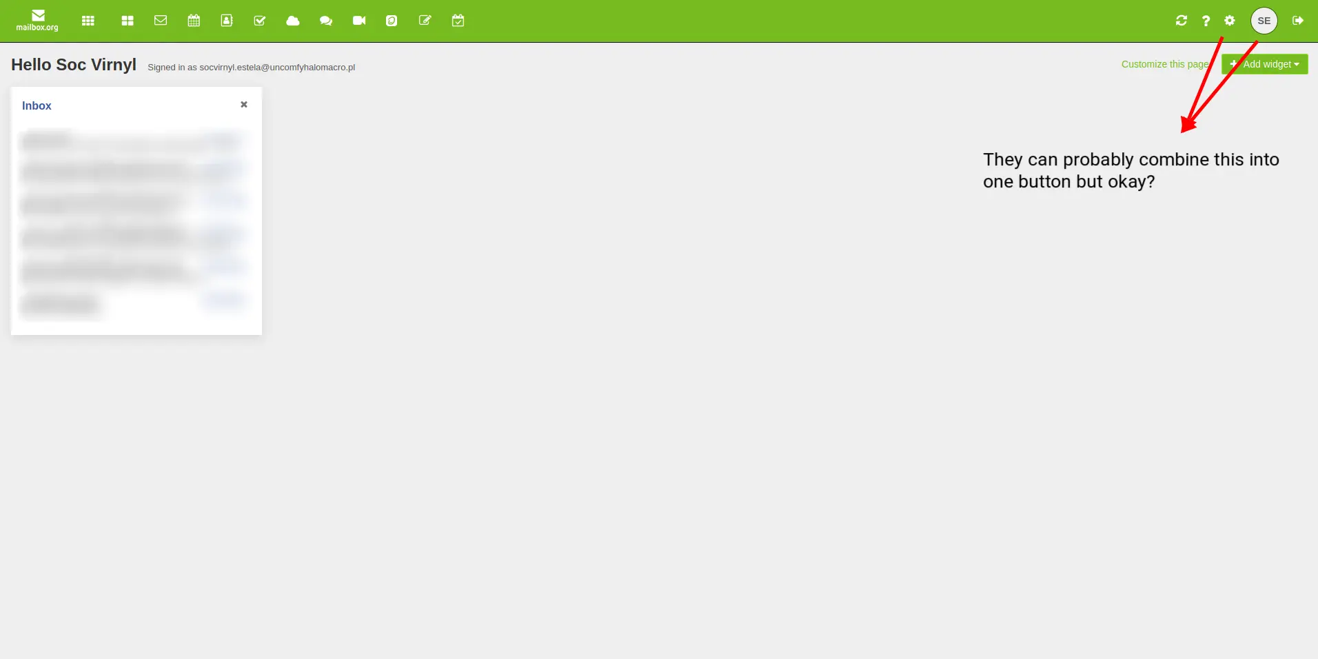
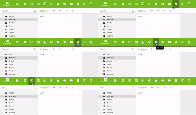
But sadly, when I bought for their services, I was not really impressed by their web client. It was... uncared for? I am not sure why the landing page looks so cool but the placement for their settings is so weird. Here are a list of screenshots so you would understand what I mean.

Another nitpick is the inconsistency of the tooltip. It should show the tooltip when the selection happens and NOT after you are centered on the button.

Also, when clicking settings, I have to click... twice? One for the gear icon, which will create two options as a drop-down; one for settings, and one for "connect your device". That's the weirdest way to navigate to settings. It's subtle but it's such a huge inconsistency. Kind of a missed opportunity.

Then what?§
For other stuff, it was alright. But it feels so dated. It's good since it's light I am fine with that. I just don't know why the placement/behavior of the buttons/settings are all over the place. Maybe I am wrong? If anyone reading this is a front-end designer or specializes in UI/UX, please tell me if I am wrong.
Services§
Well enough of the UI, how about their services?
So I bought the 9EUR per month monthly plan which amounts to 545.74PHP—Premium Plan:
- Mail Storage of 25GB
- Cloud Storage of 50GB
- 25 Mail aliases
- Allows 250 aliases for custom domains
- Gets more support
- Online office
- Priority & phone
Sounds great? To be honest, I bought this plan because I want to try the most expensive offering.
But it's too early to tell so I will try this for a year and get the yearly plan. So I will get a month using the monthly plan and once for the yearly plan; a total of 13 months. Unlucky!
I will be going to skip a bit of the features since I haven't got used to it yet. But one thing that interests me to use more and more is the DavFS/WebDav feature. Although, their documentation was not really accurate nor informative about it. Yes, they have a documentation but what I mean is, it feels rushed.
Other features are mentioned in https://mailbox.org/en/private-customers#price-plans.
Overall§
Again, it's too early to say anything. But one thing I already did is "forwarding" all my emails from my previous Gmail account to my new mailbox email addresses and aliases. And I already copied almost all of my old inboxes to my new inboxes.
Other considerations§
I was eyeing for Fastmail since
- It's recommended by my mentor (bias)
- It's in Aussieland, so it's closer. And also the only email service near southeast asia because Asia seems to have no email service company. Kind of makes sense, but I will keep it to myself 😛
- Has more enticing offerings and features. At the same price, you get 100GB and 600+ aliases.
- Probably has a better UI for their web client. Their website says it all.
For now, I will be using this for a year.